
Every click, field, and moment of hesitation stands between your supporter and their gift. If you’re running a small nonprofit team with endless to-dos, here’s welcome news: streamlining your online donation experience doesn’t demand unlimited resources—just thoughtful, strategic decisions. When you smooth out your giving process, conversions jump, transforming curious visitors into dedicated donors without piling more onto your plate.
Understanding Donation Friction
Friction is anything—technical glitches, confusing design, psychological barriers—that slows or stops a donor mid-gift. Imagine requiring someone to complete paperwork in triplicate before accepting their check. That’s the digital equivalent.
Watch out for these common obstacles:
- forms demanding too many required fields,
- confusing navigation with multiple steps,
- tiny buttons that frustrate mobile users,
- vague impact messaging,
- missing trust signals that raise security concerns.
The cost? Cart abandonment across industries averages 70.19% (Baymard Institute via RedStag, 2024), while 21% of would-be donors bail specifically because checkout feels too complicated (4aGoodCause). For nonprofits, each abandoned donation means lost revenue and missed opportunities to advance your mission.
Here’s what makes this hopeful: Organizations using optimized platforms like Funraise achieve 50% conversion rates—crushing industry norms and proving friction reduction delivers real results (4aGoodCause).
Keep Your Donation Form Brutally Simple
Your revenue depends on it. Stick to the golden rule: one page with only essential fields—name, email, amount, payment details.
Each required field creates another exit point. Studies reveal that every additional step costs you approximately 50% of potential donors (Nonprofit Hub). Yes, you read that correctly—half your supporters vanish with each unnecessary hurdle.
Form optimization essentials:
- cap at 4-6 fields maximum—going beyond increases abandonment by 20-30% (Team Allegiance),
- enable browser autofill so mobile users can zip through,
- add inline validation with clear error messages instead of cryptic warnings,
- show progress indicators only if multiple steps are unavoidable (single page wins),
- pre-select suggested amounts but always allow custom entries.
Protip: Test removing one field at a time to track impact. When Funraise users switched to pop-up forms keeping donors on the same page, they saw monthly giving conversions climb 12.1% (Funraise blog).
Mobile Optimization Is Non-Negotiable
More than half of nonprofit website visitors arrive on mobile devices, yet mobile abandonment soars to 80.2% (Funraise blog). If your donation flow isn’t mobile-first, you’re actively turning away half your potential supporters.
Mobile essentials:
- thumb-friendly tap targets (44×44 pixels minimum),
- pages loading under 3 seconds,
- responsive design for any screen,
- one-tap options like Apple Pay and Google Pay,
- vertical scrolling instead of horizontal navigation.
Try embedded forms versus pop-ups—pop-ups eliminate the friction of redirecting to third-party sites by keeping donors exactly where they are. Test both approaches with your audience.
The numbers tell the story: Funraise platform nonprofits grow online revenue 73% year-over-year—triple the industry average—partly because their tools prioritize mobile optimization (Funraise Growth Statistics).
AI Prompt: Optimize Your Donation Page
Want to spot friction on your own donation page? Copy this prompt into ChatGPT, Gemini, Perplexity, or explore our business-focused tools and calculators:
"I run a nonprofit called [ORGANIZATION NAME] focused on [MISSION/CAUSE]. Our current donation page requires [NUMBER] fields including [LIST KEY FIELDS]. Our mobile traffic is approximately [PERCENTAGE]% of total visitors. Analyze potential friction points in this donation experience and suggest 5 specific, actionable changes we can implement this month to reduce abandonment and increase conversions. Prioritize changes by potential impact vs. implementation difficulty."Replace the bracketed sections with your details for customized recommendations.
Build Trust to Eliminate Donor Fear
Security worries and uncertainty destroy conversions. Even when your process is technically secure, donors must feel confident about giving.
Strategies that build trust:
| Trust Builder | Why It Works | Impact |
|---|---|---|
| Security badges | Instant visual credibility | 48% conversion lift (4aGoodCause) |
| HTTPS seals | Demonstrates encrypted connection | Alleviates security fears |
| Clear privacy statements | Addresses data concerns upfront | Prevents hesitation |
| Impact previews | Shows fund usage (“$50 feeds 10 families”) | Links gift to mission |
| Prominent nonprofit branding | Avoids generic third-party feel | Preserves relationship |
Try this unconventional approach: Embed live donor activity feeds displaying recent gifts (“Sarah from Austin just donated $25”). This creates social proof and urgency without intrusive pop-ups, tapping into the psychology that people follow others’ lead.
Display visible contact information or live chat for questions. Simply offering human support—even if rarely used—dramatically cuts fear-driven exits.
Protip: Add “Donors Cover Fees” prompts letting supporters add a percentage to cover transaction costs. Funraise data reveals roughly 90% of donors opt in, effectively covering 100% of platform fees at only 1.5% effective cost (Funraise blog).
Balance Payment Options Without Overwhelming
The sweet spot: Enough choices to match donor preferences without triggering decision paralysis.
Payment method priorities:
- credit/debit cards (preferred by 91% of online donors),
- ACH/bank transfers for larger gifts,
- digital wallets (PayPal, Apple Pay, Google Pay),
- stock and cryptocurrency for major donors (crypto donations average $10,455 per gift).
For amounts, limit suggestions to 3-5 options while making custom amounts prominent. Display one-time and recurring toggles upfront—never buried as an afterthought.
Recurring giving now accounts for 31% of online nonprofit revenue and grows 52% year-over-year for organizations using optimized platforms (NPTech for Good). Make recurring options visible and attractive from the start.
Consider AI-powered upsells appearing after the initial gift, suggesting options like “Double your impact with a monthly gift?” This capitalizes on donor momentum without adding friction to the primary conversion.
Perfect Your Post-Donation Experience
The donation button isn’t your finish line—it launches a relationship. Your post-donation sequence should instantly confirm the gift, deliver clear receipts, and set expectations.
Thank-you page best practices:
- immediate confirmation (never “we’ll email you later”),
- downloadable/emailed tax receipt,
- social sharing with pre-written messages,
- optional (never mandatory) survey or next steps,
- clear impact statement reinforcing their decision.
Skip this: Mandatory surveys or complicated follow-up forms. Instead, use automated email sequences for personalized communications—Funraise’s automation helps organizations boost recurring giving 52% annually without manual effort (Funraise Growth Statistics).
Protip: Add QR codes to direct mail appeals linking to mobile-optimized donation pages. This seamlessly connects offline and online channels, reducing friction for supporters who appreciate physical mail but prefer digital giving.
Track, Test, and Keep Improving
You can’t fix friction you can’t see. Monitor these essential metrics:
- donation abandonment rate (starts versus completions),
- time-to-complete (target under 60 seconds),
- device breakdown (mobile versus desktop completion),
- field-specific drop-offs (exact exit points).
Leverage Google Analytics, heatmap tools, or your platform’s built-in analytics—Funraise’s real-time reporting dashboards help users generate 2x peer-to-peer revenue versus industry averages (Funraise Growth Statistics).
Test boldly, not cautiously. Since every extra step costs roughly 50% of donors, measure before and after changes to your process. Small adjustments compound into significant revenue gains.
Building Your Friction-Free Future
Eliminating friction doesn’t require cutting-edge technology or bottomless budgets—it demands ruthlessly removing barriers between supporters and their desire to advance your mission. Begin with your donation form and mobile experience, then systematically tackle trust signals, payment flexibility, and post-donation flows.
The data proves it works: Organizations implementing these friction-reduction strategies achieve 73% online revenue growth—even with lean teams (Funraise Growth Statistics).
Curious what truly optimized donation tools can accomplish? Funraise offers a free tier perfect for testing with zero commitments, plus premium options scaling with your growth. With mobile-first design, built-in analytics, and automation reducing workload while boosting conversions, it’s worth exploring how friction-free giving can transform your mission.
Start reducing friction today—your donors and revenue will both thank you.
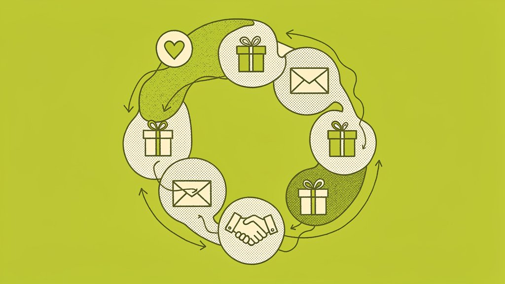
Mastering the Donor Cycle: A Step-by-Step Guide to Turning First-Time Givers into Lifelong Partners
Here's the reality: Only 18–20% of first-time donors ever give again (Association of Fundraising Professionals). But there's a silver lining—when someone makes that second gift (what we call the "golden donation" ), their likelihood of giving again jumps to approximately 60% (Nonprofit Hub). This dramatic shift shows why understanding the donor cycle is critical for…
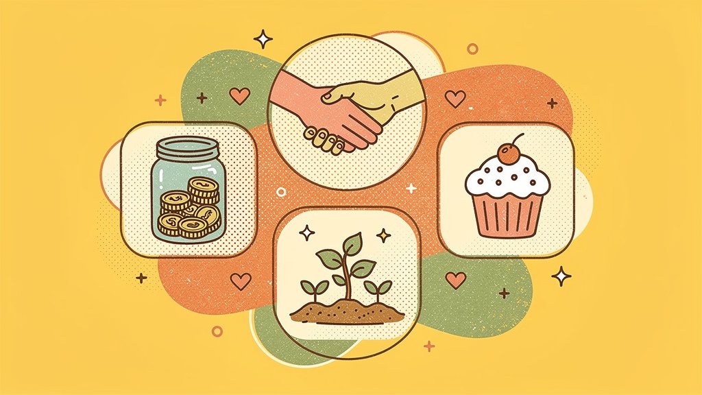
17 Grassroots Fundraising Ideas for Community Nonprofits
Grassroots fundraising empowers community nonprofits to raise funds from local supporters through low-cost, high-engagement tactics like events, peer-to-peer drives, and partnerships. These strategies build lasting donor relationships without relying on big grants or corporations—perfect for small teams working hard to make an impact without burning out. Recent data paints an interesting picture: US nonprofits experienced…
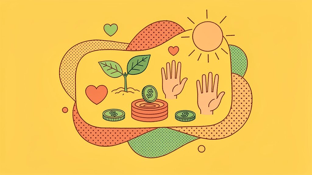
60 High-Impact Spring Fundraising Ideas for Nonprofits to Re-engage Supporters
Spring isn't just about blooming flowers and warmer weather—it's your golden opportunity to reconnect with supporters who've drifted away. With donor retention rates averaging around 45% industry-wide (Funraise.org), there's massive potential to reactivate lapsed donors through strategic, seasonal campaigns that remind them why they fell in love with your mission. The best part? You don't…